Intro
Product collection pages are sadly often overlooked by designers and copywriters alike. While a lot of effort goes into creating wildly engaging product pages and landing pages, collection pages fall by the wayside and remain woefully uninteresting.
Let’s look at six actionable ways to create product collection pages that engage, inspire action, and drive traffic and conversions.
Ensure the Primary Product Photo Is Engaging
The first design obstacle product collection pages need to overcome is ensuring the primary photo is engaging and interesting. If you don’t capture a shopper’s attention practically as soon as they land or within a couple of scrolls, you’ve probably lost them.
Start by considering everything you know about your target audience. What do they like? Why do they like your products? What is it about your products they like? How can you put these features front and center?
Then, start considering the layout. Do the images need to be zoomed in? Do they require a vibrant or a neutral background? How many products should you show in a row?
Ideally, you will A/B test several design variations. Sometimes, the smallest changes can make the most difference.
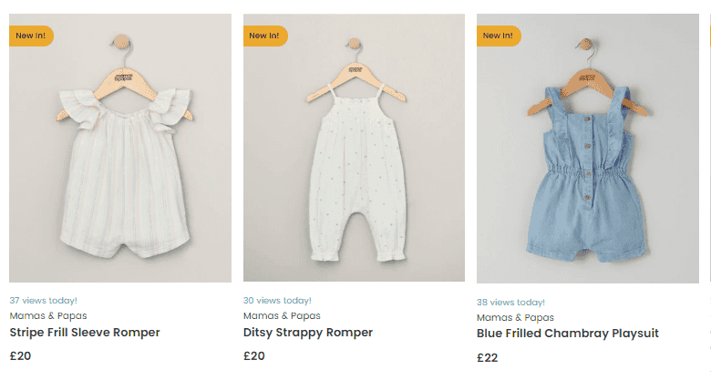
Look at this baby clothing collection page. The products themselves are cute and engaging, so they don’t need to be displayed in any particularly novel way. The “new in” label clearly sets certain products apart and ensures the shopper notices them.
The All-in-One Platform for Effective SEO
Behind every successful business is a strong SEO campaign. But with countless optimization tools and techniques out there to choose from, it can be hard to know where to start. Well, fear no more, cause I've got just the thing to help. Presenting the Ranktracker all-in-one platform for effective SEO
We have finally opened registration to Ranktracker absolutely free!
Create a free accountOr Sign in using your credentials
Setting products like this against a neutral background is a great way to make them stand out.
Source: mamasandpapas.com
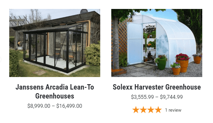
Another way to make the primary photo on a collection page engaging is to show the item in use. If you look at this lean-to-greenhouses page, you’ll see how this can be effortlessly executed. Every image is completely different, in a different color palette and showing the item from a different angle. They’ve made it easy to imagine the product in your own home.
Source: greenhouseemporium.com
The All-in-One Platform for Effective SEO
Behind every successful business is a strong SEO campaign. But with countless optimization tools and techniques out there to choose from, it can be hard to know where to start. Well, fear no more, cause I've got just the thing to help. Presenting the Ranktracker all-in-one platform for effective SEO
We have finally opened registration to Ranktracker absolutely free!
Create a free accountOr Sign in using your credentials
This is a great tactic if you want to make it easier for the customer to see what the final product would look like, and help them imagine an entire lifestyle.
Ensure Filters Aren’t Too Distracting
Collection pages require filters in order to be useful. Customers can’t be expected to browse through pages upon pages of products to find one specific item. They aren’t likely to be aware of the breadth of your offer, and they may not have time for lengthy window shopping.
Filters should categorize your products in meaningful ways. Price, size and material are just some of the most common filters to use. Consider the products themselves and what the differentiating factors are.
The more complex the product, the more filters there should be. You can also offer helpful ones like “not for beginners” or “only for pros” if they will help customers select the right item.
Filters also shouldn’t be too distracting. They should be easy to access, but not take up a large portion of the page, or in any way interfere with the browsing experience.
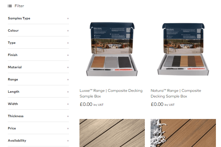
Take a look at this composite decking boards collections page. The filters are provided on the left, and they strike the right balance between easily noticeable and not in the way. Note that they are also collapsible, so the sheer amount of information won’t overwhelm a customer.
They’ve also been ordered in a logical way – most people will want to narrow down the colors and materials before they dive into more specific details, like size.
Source: Ovaeda.com
You can easily implement a similar solution that won’t take up a lot of space but that will still significantly enhance user experience and allow customers to narrow down their choice in a matter of seconds.
Display Short Product Descriptions on Hover
Think of product collection pages as an information hub. This is where you display all of your products in a certain category. The more helpful you are, the likelier a customer is to convert.
Try not to make shoppers click on an item, read the product description, and then click back. They have to waste their time scrolling to figure out where they just left off. Or, if they keep opening products in new tabs, they are soon going to get overwhelmed by the number of items they are trying to compare.
The more useful information you are able to display on the collection page, the better. By adding a simple, short product description when someone hovers over a product, you can help customers compare products right then and there.
This bariatric calcium chews collection page does a great job. You get a brief product description, telling you which vitamins and minerals you can find in the product. The benefits are also highlighted: it tastes great, it promotes immune health, and so on.
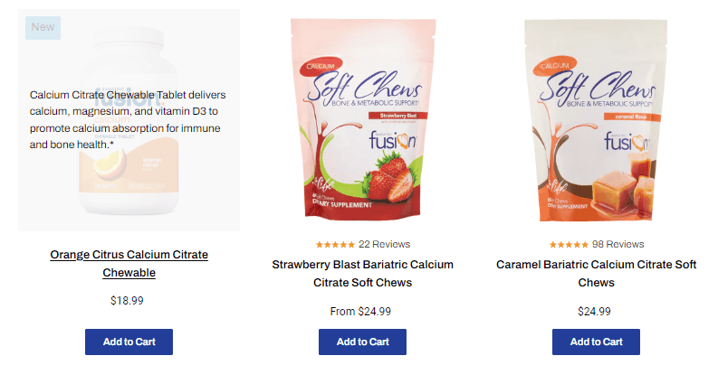
_Source: Bariatricfusion.com _
Note how short the descriptions are. You can read them in a couple of seconds and continue to compare products.
When applying this tactic, carefully consider the hover description. It doesn’t need to be the same as the description on the product page. It should briefly discuss the benefits or key features of the item, clearly setting it apart from other products on the page.
Focus on being informative rather than on pushing a sale here. Customers are more likely to convert if they are confident in their choice.
Throw in Some Social Proof
Social proof is a great tool for making pages more engaging and helpful. They will show your customers that you are trustworthy, reliable and that your products are of good quality. This is especially important for new customers who are not yet familiar with your brand and who may be more hesitant to convert.
Social proof comes in many forms, but star ratings are the most useful type of proof to put on your collection pages. They will serve several purposes:
- rate the quality of the individual product
- show how many customers have purchased it and taken their time to review it
- help customers make faster purchasing decisions
Star ratings are easy to incorporate. Check out Sephora’s eyeshadow palette collection page. They are easy to spot and display all the relevant information: how many reviews there are and what the overall satisfaction with the item is. You can also clearly see that one of these palettes is a lot more popular than the others.
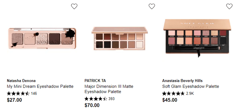
Source: sephora.com
Another great social proof signal to incorporate on your collection pages are real-time sale notifications.
Check out this custom laptop stickers page. While you’re browsing, an unobtrusive popup comes in at the bottom right corner, telling you who has made a purchase on the website, where they are from and what they have bought.
This is a great way to add a bit of FOMO to your marketing tactics. Customers will be shown other items, items that are clearly popular because someone has just purchased them. It will also send strong trust and credibility signals.
Make sure the popup isn’t too flashy or distracting. Also, try to space them out so that they don’t start to annoy shoppers.
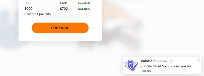
Source: vinylstatus.com
Display Multiple Product Views
The better customers are able to see a product, the higher the chances they will convert. The more images of an item you display on the collection page, the more engagement and interest you will generate.
You can incorporate more than one image in a couple of ways. You can allow scrolling through a product gallery, or you can display a different photo on hover.
This boys clothing page from H&M features a scrollable product gallery. You can see all the photos that are featured on the individual product page right from the collection page, so you never have to click away.
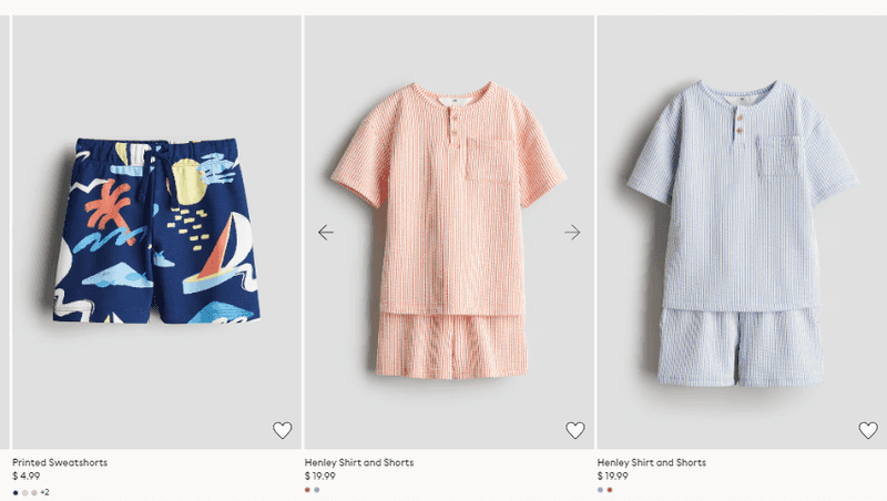
Source:hm.com
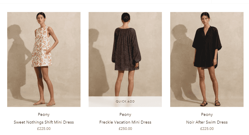
If you would prefer to just display a different photo on hover, check out this women’s beachwear collection page for inspiration. The brand is cleverly showing the back of the item on hover, so you can see the entire piece without having to open another page. This is a great tactic for clothing brands.
Source:simplybeach.com
When choosing whether to add a gallery or a hover photo, consider the nature of the item. How many photos does a shopper need to see? And what should those photos be?
You can show the product being used, or you can feature customer’s photos if they are more likely to sway a new shopper. You can show the item up close, or even list product specifications.
Display Recently Viewed Items
Product recommendations are usually reserved for individual product pages. This is also where brands will put the “recently viewed” carousel.
However, by featuring it on the collection page, you can gently remind customers of the items they’ve already seen and liked. Save them time and effort in going back through their history of having numerous tabs open at the same time.
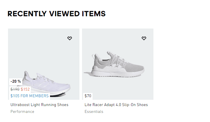
Check out the Adidas men’s running shoes page. As soon as you view an individual product, you’ll get a “recently viewed” feature at the bottom of the collection page, helping you keep an eye on the items that have piqued your interest.
The All-in-One Platform for Effective SEO
Behind every successful business is a strong SEO campaign. But with countless optimization tools and techniques out there to choose from, it can be hard to know where to start. Well, fear no more, cause I've got just the thing to help. Presenting the Ranktracker all-in-one platform for effective SEO
We have finally opened registration to Ranktracker absolutely free!
Create a free accountOr Sign in using your credentials
Source: adidas.com
The same carousel is also featured on individual product pages, making for an individually tailored browsing experience.
You can also recommend products to customers based on the items they have viewed, just like you would on product pages.
Wrapping Up
Consider which of these product collection page design tactics you can implement on your own pages. Perhaps all six can play a role in boosting your conversion rates.
Always have the nature of your product(s) and the pain points of your audience in mind. What are they looking for, and how can your design efforts help them find it?

