Intro
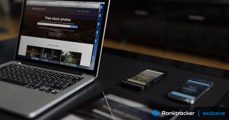
Imagine stepping into a digital realm where every website you visit, regardless of the device in your hand, feels like it was tailor made just for you. This isn't a vision of the future it's the magic of responsive web design in action today.
In the dawn of the digital age, the website was the handshake of the virtual world—a business's first impression. But as technology sprinted forward, bringing with it an array of devices from desktops to smartphones, and even to the screens of our wristwatches, that handshake often felt awkward. The challenge? Crafting a digital experience that felt personal and seamless, no matter the device.
Responsive web design emerged as the hero of this digital narrative. It's not just a technical term or a fleeting trend it's the art and science of ensuring every user feels seen and understood. With responsive web design, a website gracefully adjusts, ensuring that its narrative flows smoothly whether it's being read on a sprawling monitor or a pocket sized screen.
But why all this buzz around responsive web design? Because it's the bridge to a world where technology serves us, not the other way around. It's the promise that as devices continue to evolve, our digital experiences won't fracture or falter. Instead, thanks to responsive web design, they'll adapt, evolve, and continue to captivate.
So, as we navigate this digital age, the mission is clear: to craft experiences that resonate universally across devices. And the compass guiding us on this journey? None other than responsive web design, however there is a different perspective and approach for different types of websites, for example the ecommerce web design might differ a lot from other sites. When considering a holistic digital approach, many businesses consult with agencies like Link Gathering to ensure that every digital touchpoint is optimized.

The All-in-One Platform for Effective SEO
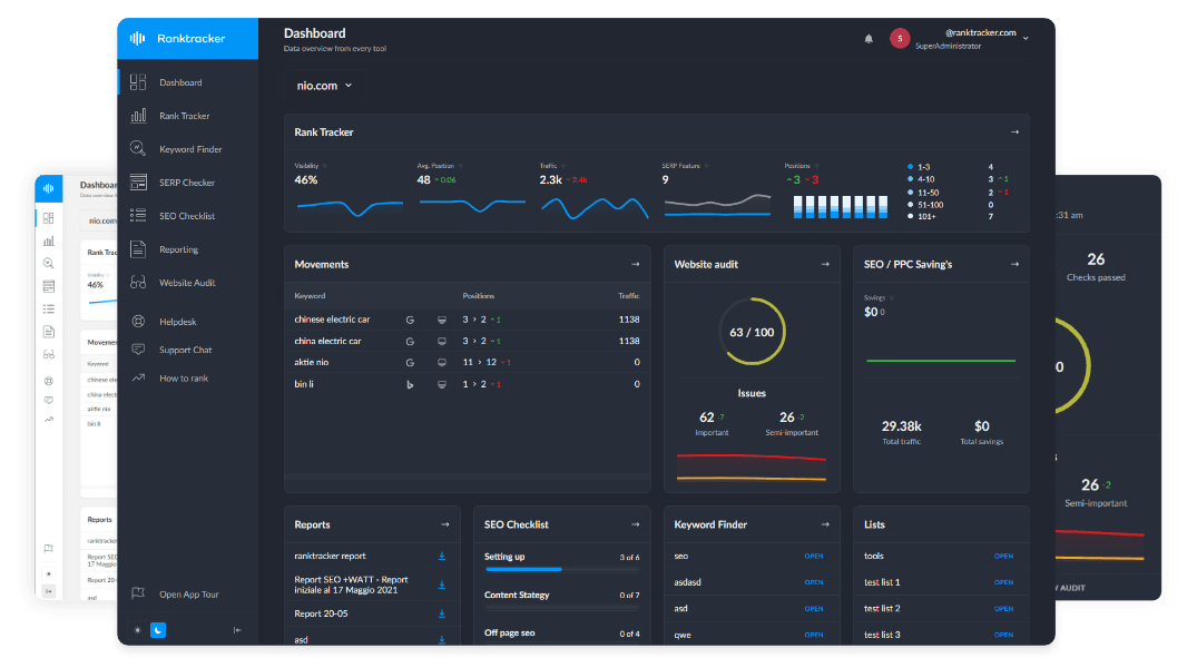
Behind every successful business is a strong SEO campaign. But with countless optimization tools and techniques out there to choose from, it can be hard to know where to start. Well, fear no more, cause I've got just the thing to help. Presenting the Ranktracker all-in-one platform for effective SEO
We have finally opened registration to Ranktracker absolutely free!
Create a free accountOr Sign in using your credentials
Source: Freepik
The Power of First Impressions
Imagine you're a user, perhaps someone browsing from a sunlit cafe in California. You stumble upon a website, maybe looking for some top notch web design inspiration websites. As the page loads, the seconds feel like minutes. One, two, three... and there it is. Your mind, seasoned by the rapid pace of the digital age, has already started sketching its first impressions. It's not impatience, nor is it a critique of the California web design aesthetics. It's the universal 3 second rule playing out.
Those first few moments when a user lands on a site? They're as precious as golden California sunsets. It's more than just a window; it's a fleeting moment of opportunity. A chance to captivate, to spark curiosity, to echo the promise of value that great web design always delivers.
But what happens when a website fumbles this first act? The repercussions are swift and unforgiving. A sluggish load time, a jarring layout, or a confusing interface can send users bouncing off faster than they arrived.
This isn't just about losing a potential click or sale it's about the ripple effect of a tarnished first impression. High bounce rates are the silent alarms, signaling that something's amiss. Lost sales translate to missed opportunities, and over time, these missed moments can accumulate, chipping away at a brand's reputation.
In the vast ocean of the internet, where countless websites vie for attention, standing out is no longer just about being seen. It's about being remembered for the right reasons. It's about ensuring that the first impression isn't just good, but unforgettable. Because in the end, the cost of a bad user experience is not just in the numbers it's in the lost trust and the stories left untold.
Understanding Responsive Web Design (RWD)

Source: Freepik
The All-in-One Platform for Effective SEO
Behind every successful business is a strong SEO campaign. But with countless optimization tools and techniques out there to choose from, it can be hard to know where to start. Well, fear no more, cause I've got just the thing to help. Presenting the Ranktracker all-in-one platform for effective SEO
We have finally opened registration to Ranktracker absolutely free!
Create a free accountOr Sign in using your credentials
Picture a chameleon, effortlessly changing its colors and patterns to blend into any environment. Now, imagine if websites could do the same, adapting seamlessly to fit the screens of any device. This isn't nature's magic it's the marvel of Responsive Web Design (RWD).
At its core, RWD is more than just a technical term. It's a philosophy, a commitment to ensuring every user, regardless of their device, receives an optimal viewing experience. But how does this digital chameleon work its magic?
Dive beneath the surface, and you'll find a symphony of fluid grids, flexible images, and media queries working in harmony. These elements are the unsung heroes, ensuring that content resizes, repositions, and reflows to deliver a consistent and captivating experience.
Yet, to label RWD as just another design trend would be a grave understatement. In a world where the digital frontier is constantly expanding, with new devices and screen sizes emerging at breakneck speed, RWD isn't merely a luxury—it's a necessity. It's the bridge ensuring that as technology evolves, our digital experiences remain inclusive, accessible, and delightful
Benefits of a Responsive Design

Source: Freepik
Imagine a world where every visitor, whether they're cradling a smartphone or seated before a sprawling monitor, feels as if the digital stage was set just for them. This is the promise of User Satisfaction in responsive design—a seamless, tailored experience that whispers to each user, "This was made for you."
But the artistry doesn't stop at the user's delight. In the grand theater of search engines, where Google stands as the discerning critic, responsive design takes center stage. Improved SEO is the standing ovation, a testament that mobile friendly sites aren't just preferred they're celebrated.
Yet, beyond the applause and accolades, there's a pragmatic side to this design philosophy. In the intricate ballet of web development, where every hour translates to costs, responsive design offers a harmonious solution. Cost Efficiency emerges, painting a picture where one masterful design gracefully adapts across devices, reducing both development time and maintenance costs.
And as the final note in this symphony, there's FutureProofing. In a digital world that's evershifting, ever evolving, responsive design stands as the timeless masterpiece. It's the assurance that as tomorrow's devices emerge, casting new sizes and shapes, the digital experience will remain undistorted, unbroken, and as enchanting as ever.
Key Elements of Smooth User Experience in RWD

Source: Freepik
You know, when I think about the web, I often imagine it like a bustling city. And in this city, websites are like buildings. Some are skyscrapers, others cozy cafes, but all have a purpose. Now, imagine walking into one of these buildings and everything just... flows. That's what a smooth user experience in RWD feels like.
First off, there's Speed. Man, it's like that first sip of coffee in the morning. You don't always acknowledge it, but you'd definitely miss it if it wasn't there. It's the unsung hero, the wind beneath the wings of user satisfaction. No one wants to wait, right? We want things and we want them now. Speed ensures we're not left hanging.
Then there's Intuitive Navigation. Picture this: you walk into a massive library, but there's no index, no signs, nothing. Frustrating, right? If users can't find what they're looking for, it's like it doesn't even exist. Good navigation is like a friendly librarian guiding you to that book you didn't even know you needed.
And don't get me started on Consistent Design Elements. It's like when you visit your childhood home and everything feels familiar and comforting. That old couch, the creaky floorboard – they all tell a story. Similarly, when design elements are consistent, it's like a warm hug to users. Familiarity? Yeah, it's a comfort blanket in the digital chaos.
Lastly, there's Adaptable Content. Imagine wearing an outfit that fits perfectly, whether it's a sunny day or pouring rain. That's what adaptable content does. It ensures that no matter where you view it – be it a phone, tablet, or desktop – it just looks and feels right. Every time.
Challenges in Implementing RWD

Source: Freepik
Alright, so diving into the world of RWD is kinda like learning to ride a bike. It's super cool once you get the hang of it, but man, there are some bumps and scrapes along the way.
First up, there's this whole dance between design and functionality. It's like trying to make a sandwich with all your favorite ingredients, but it's gotta look Instagram Worthy too. You want that juicy functionality, but it's gotta look sleek. Sometimes, it feels like choosing between a comfy sneaker and that stylish, slightly too tight shoe. The struggle is real.
Then, oh boy, there's the challenge of compatibility with older devices and browsers. Picture this: You've got this shiny new toy, but you've also got pals with some vintage gear. Now, you've gotta make sure your toy plays nice with everyone. It's like trying to jam to the latest hits on an old school cassette player. Some devices and browsers are just stuck in their retro vibes, and making them groove to the modern beat?
Quite the task. And, of course, there's the world of testing and tweaking. Imagine painting a room. You put on a coat, step back, and think, "Maybe a bit more to the left?" It's a never ending dance of adjustments. The digital paintbrush is always in hand, and the canvas of the web is ever evolving. It's all about the journey, and trust me, it's a winding road.
Now, imagine trying to capture the essence of that room, making it so inviting that it draws people in, compelling them to stay and explore.
The All-in-One Platform for Effective SEO
Behind every successful business is a strong SEO campaign. But with countless optimization tools and techniques out there to choose from, it can be hard to know where to start. Well, fear no more, cause I've got just the thing to help. Presenting the Ranktracker all-in-one platform for effective SEO
We have finally opened registration to Ranktracker absolutely free!
Create a free accountOr Sign in using your credentials
That's where the expertise of a b2b lead generation agency like Leadiax comes into play. Just as an artist uses strokes to bring a canvas to life, a lead generation has strategies to illuminate the digital space, turning casual visitors into engaged prospects. It's not just about painting a pretty picture it's about creating an environment where connections are made, relationships are built, and businesses thrive.
Conclusion
It's not just a backdrop it's the heartbeat, the rhythm that drives the narrative forward. The link between responsive design and business success isn't just a line in the sand it's a lifeline. Businesses that embrace this philosophy aren't just adapting they're thriving, setting the pace in a race where the finish line keeps moving.
And let's face it, the digital landscape is shifting beneath our feet. Gone are the days when desktops reigned supreme.
Today, the world is literally at our fingertips, with mobile devices becoming extensions of ourselves. The future? It's not on the horizon it's here, unfolding in realtime in the palm of our hands. The future is mobile, and it's vibrant, dynamic, and unstoppable.
So, as we stand at this crossroads, the message is clear: adaptability isn't just a strategy it's survival. Responsive design is the compass that points businesses in the right direction. And in this ever evolving digital dance, there's no room for hesitation. The beat goes on, and the mantra for success is simple: keep up or risk being left in the dust.

