Intro
Capturing a user's attention is more challenging than ever. But website pop-ups can be a powerful instrument for instantly grabbing their attention, enhancing engagement, and ultimately driving conversions.
However, when misused, they can quickly become a source of annoyance, pushing potential customers away. The key lies in understanding the delicate balance between being informative and being intrusive. Pop-ups, at their core, are meant to provide users with timely, relevant information or offers.
So in this guide, we’ll talk about the best practices for effective pop-up integration, ensuring that they not only capture attention but also contribute positively to user retention. Whether you're a seasoned marketer or a business owner looking to dip your toes into the world of pop-ups, this guide will equip you with the knowledge to use them to their fullest potential.
- Know Who You Are Integrating Pop-Ups for?
“Ah, the age-old marketing mantra: "Know thy audience." It's been echoed throughout boardrooms and brainstorming sessions for decades, and for a good reason. When it comes to pop-ups, this principle is no different.”, says Graham Grieve, Scottish Travel Blogger at My Voyage Scotland.
Rightfully so.
Let's dive into why understanding your audience is the cornerstone of crafting effective pop-ups.
The All-in-One Platform for Effective SEO
Behind every successful business is a strong SEO campaign. But with countless optimization tools and techniques out there to choose from, it can be hard to know where to start. Well, fear no more, cause I've got just the thing to help. Presenting the Ranktracker all-in-one platform for effective SEO
We have finally opened registration to Ranktracker absolutely free!
Create a free accountOr Sign in using your credentials
Imagine walking into a store and being handed a flyer for senior citizen discounts when you're in your twenties. It's not just irrelevant; it's borderline amusing.
Similarly, showing a pop-up about a summer sale to someone browsing winter wear can be just as off-putting.
Pop-ups should feel like a personalized note, not a mass-produced flyer.
As Martin Seeley, CEO of Mattress Next Day, says, “Every visitor on your website has unique preferences, needs, and browsing habits. By tailoring your pop-ups to these nuances, you're essentially saying, "Hey, I see you, I understand what you're looking for, and here's something just for you.””
It's this personal touch that can make the difference between a user clicking on your pop-up or promptly closing it.
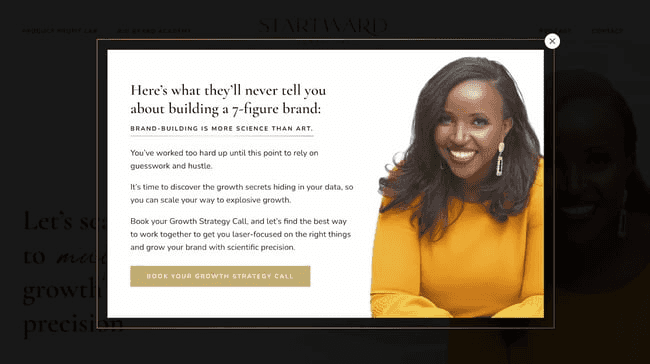
Here’s an excellent example of it by Startward Consulting. She knows exactly who’s she talking to and what those people want and need:
The All-in-One Platform for Effective SEO
Behind every successful business is a strong SEO campaign. But with countless optimization tools and techniques out there to choose from, it can be hard to know where to start. Well, fear no more, cause I've got just the thing to help. Presenting the Ranktracker all-in-one platform for effective SEO
We have finally opened registration to Ranktracker absolutely free!
Create a free accountOr Sign in using your credentials
- Go for One Clear Objective
Ever been on a road trip without a destination in mind? While it might sound adventurous, in reality, you'll probably end up wasting a lot of gas and time.
Similarly, launching a pop-up without a clear objective is like setting sail without a compass. You might catch a few fish along the way, but you'll likely miss the treasure island.
As Stephanos Oikonomou, Director at GoVisaFree, says, “Every pop-up you design should serve a purpose. Without a clear objective, you risk creating something that's not only ineffective but also potentially annoying to your users.”
A pop-up should never exist just for the sake of it; it should always aim to achieve a specific outcome.
Think of it this way: if you're going to interrupt a user's browsing experience, even momentarily, you better have a good reason. And that reason should be evident not just to you but to the user as well. A clear objective ensures that your pop-up is concise, relevant, and offers genuine value.
So, before you dive into designing that flashy pop-up, take a step back and ask yourself: "What do I want to achieve with this?" The answer will set the course for a more effective and user-friendly pop-up experience.
- Use Different Flavors
Sam McKay, CEO of Enterprise DNA, explains with a perfect analogy, “Pop-ups can be like ice cream. Just as there's a flavor for every ice cream lover, there's a pop-up format for every kind of user and objective.”
From the classic vanilla (your standard center-screen pop-up) to the more exotic raspberry ripple (a flashy video pop-up), the choices are vast. But how do you pick the right one?
-
1. Center-Screen Pop-ups: The classic. It appears smack dab in the middle of the user's screen. Hard to miss, making it great for important announcements or offers.
-
2. Slide-Ins: These slide in from the side or bottom, usually after a user has been on a page for a certain amount of time or has scrolled a specific percentage. Less intrusive than center-screen pop-ups, they're perfect for secondary offers or reminders.
-
3. Fullscreen Overlays: Takes over the entire screen, ensuring the user's full attention. Ideal for big announcements, like product launches or major sales. It's bold and demands attention.
-
4. Floating Bars: These are bars that either sit at the top or bottom of a user's screen as they browse. Constant visibility without obstructing content. Great for ongoing offers or important notices.
-
5. Video Pop-ups: Instead of static content, these pop-ups play a video when triggered. Highly engaging, perfect for product demos, testimonials, or brand stories.
-
6. Exit-Intent Pop-ups: Triggered when a user is about to leave the site, based on mouse movement. A last-ditch effort to offer something compelling and keep the user engaged.
“The key to picking the right pop-up format lies in understanding your objective and your audience's behavior. You can’t use a pop-up that’s all focused on selling, whereas the audience you know is there only to get a freebie or just to understand you better.”, Sarah Jeffries, Qualified Mental Health First Aid Trainer at First Aid Courses Manchester explains this further.
Here are some quick tips:
- For Important Announcements: Go with fullscreen overlays. They're bold and ensure the message gets across.
- To Boost Engagement: Video pop-ups can be a game-changer. They're dynamic and can convey a lot in a short time.
- For Subtle Reminders: Slide-ins or floating bars are your best bet. They're there, but they don't disrupt the browsing experience.
- To Prevent Page Abandonment: Exit-intent pop-ups can offer a special deal or a reminder, giving users a reason to stay.
Just like you wouldn't serve the same ice cream flavor at every party, you shouldn't use the same pop-up format for every objective.
- Use Consistent Design
“You're engrossed in reading a gripping novel, and suddenly, a page from a completely different book is inserted in the middle. Jarring, right? That's exactly how users feel when they encounter a pop-up that looks out of place on a website.”, says Tiffany Parra, Owner of FirePitSurplus.com.
Just as every chapter in a book should feel cohesive, every element on your website, including pop-ups, should feel like it belongs.
A consistent design builds trust. When a pop-up mirrors the look and feel of the website it's on, users are more likely to trust its content. It feels familiar, authentic, and safe. On the flip side, a pop-up that looks out of place can come off as spammy or even malicious, leading users to close it immediately.
Douglas McShane, Operations Director at Leeds First Aid Courses, explains, “A pop-up should feel like a natural extension of your website, not an afterthought. So you not only enhance the user experience but also boost the credibility and effectiveness of your pop-ups.”
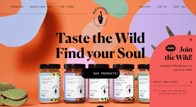
Here’s an excellent example of his by Wild Souls:
- Crafting Compelling CTAs
Imagine being at a crossroads with no signposts. Confusing, right? CTAs (Call-to-Action) are those signposts, guiding users on what to do next.
As Ashley Newman, Content Director at Accountant Glasgow, says, “A well-crafted CTA doesn't just tell users what to do; it makes them want to do it. All the design elements, copy, and visuals lead up to this one action you want the user to take. Whether it's "Sign Up," "Learn More," or "Grab the Deal," the CTA is the bridge between user interest and user action.”
Make your CTAs winners by:
- Clear Language
In the vast world of digital interactions, clarity is paramount. Users should never be left guessing when it comes to understanding the purpose of a CTA. An ambiguous call can lead to hesitation, or worse, users might bypass the CTA entirely. Instead of generic phrases like "Click Here," which don't give users any context, it's crucial to be explicit and clear.
For instance, "Download Your Free eBook" gives the user a precise expectation of the result of their click. As Sumeer Kaur, Founder of Lashkaraa.com said, "In a sea of information, clarity is the lighthouse guiding user action.”
- Convey Urgency
Procrastination is a universal human trait, and in the online realm, it's even more prevalent. To combat this, infusing your CTA with a sense of urgency can be the push users need to act immediately. Phrases like "Limited Offer" or "Only a Few Left!" tap into the fear of missing out, nudging users to seize the opportunity while it's still available.
- Action-Oriented Verbs
The beginning of any journey is often the hardest part. To overcome this inertia, CTAs should start with a verb that compels and prompts action. These verbs set a proactive tone and can make the difference between passive browsing and active engagement. Consider CTAs like "Get Started," "Discover More," or "Join Now." They urge users to take that pivotal first step. Julia Dunlea, VP of Marketing at Akkio, suggests, "Every great action begins with a verb. Make yours count."
- Highlight Benefits
Everyone wants to know, "What's in it for me?" When a user encounters a CTA, they're subconsciously evaluating the benefits of taking that action. Instead of a simple "Subscribe," which merely states an action, "Subscribe and Get 10% Off" paints a vivid picture of the value the user will receive. It's essential to always spotlight the rewards that await users upon engagement.
Crafting a compelling CTA is both an art and a science. It's about understanding human psychology, what drives us to act, and then packaging that insight into a button that's too good to ignore.
Take the advice of Eran Mizrahi, CEO of Ingredient Brothers, “Whenever you're designing a CTA, remember: it's not just a button—it's the final act in your pop-up's performance. Make it count.”
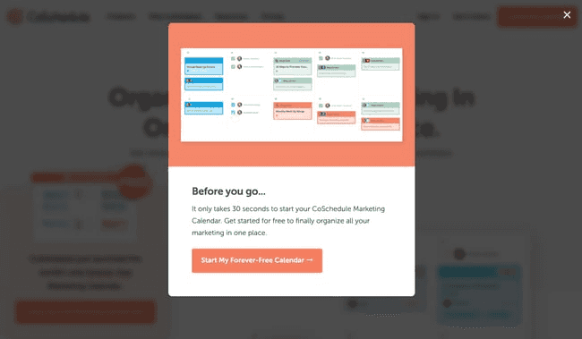
Here’s a winner CTA example by Coschedule:
- Bring Brevity in Copywriting
“We live in an age of information overload. Every day, users are bombarded with content, from social media posts to emails, making their attention span shorter than ever. So brevity is now the essence of effective communication.”, Hamza G. Email Outreaching Expert at Outreaching.io & Newsjacking.io adds an excellent point.
When a pop-up appears on a user's screen, you have mere seconds to convey your message before they decide to engage or dismiss. In this fleeting moment, clarity is your best friend. A concise message ensures that the user can quickly grasp the value you're offering, making them more likely to take the desired action.
When asked, Brandon Armstrong, CEO of Quinable Inc, explains, “Imagine this: If you're at a busy train station and someone hands you a lengthy pamphlet, you're likely to tuck it away for later (or discard it). But if they hand you a card with a clear, bold message, you'll get the point instantly.”
So before writing, ask yourself, "What's the core message I want to convey?" Once you have that, build your copy around it. Instead of "Sign up to receive our newsletter which offers insights, tips, and exclusive deals," go with "Get exclusive deals & tips! Sign up now."
- Deliver Value Through Pop-ups
Douglas McShane, Operations Director at Sheffield First Aid Courses, says, “Let's face it: no one wakes up thinking, "I hope I encounter a bunch of pop-ups today!" So, when a pop-up does appear on a user's screen, it's essentially an interruption. But what if that interruption felt more like a pleasant surprise? That's where value comes into play.”
By ensuring your pop-ups offer genuine value, you transform them from mere interruptions to delightful interludes.
A pop-up's success isn't measured by how well it grabs attention but by how effectively it offers value.
When asked, Cole Vineyard, CEO and Founder of Teach Simple, explains with an analogy, “Think of it as a trade: you're asking users for their time, attention, or even personal details. In return, they should receive something beneficial. This mutual exchange fosters trust and increases the likelihood of engagement.”
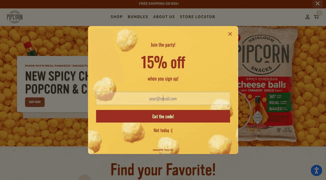
Here’s an excellent example by Pipsnacks:
Ideas for Value-Driven Pop-ups:
- Offer discounts or special promotions, like "Flash Sale! Get 20% off for the next 2 hours."
- Provide exclusive content to subscribers, such as "Unlock our exclusive guide on mastering digital marketing."
- Share in-depth resources like ebooks, for example, "Dive deep into the world of sustainable fashion with our free ebook."
- Grant early access or sneak peeks to new products, like "Sign up for early access to our new skincare range."
- Engage users with contests or giveaways, prompting them with "Enter our summer giveaway to win a tropical vacation!"
- Encourage feedback in exchange for rewards, suggesting "Share your thoughts and receive a $10 voucher."
So, the next time you're crafting a pop-up, ask yourself: "What's in it for the user?" The answer will guide you towards creating pop-ups that truly resonate.
- Gamification and Engagement
“Ever been so engrossed in a game that you lost track of time? That's the power of gamification. By adding game-like elements to non-game environments, you can drive engagement, motivation, and even joy.”, says Chase Hughes, Founder of ProAI.
In the realm of pop-ups, gamification can transform a mundane interaction into a memorable experience.
At its core, gamification taps into our innate love for challenges, rewards, and achievements. When users encounter a gamified pop-up, they're not just seeing a message; they're getting an invitation to interact, play, and potentially win.
The All-in-One Platform for Effective SEO
Behind every successful business is a strong SEO campaign. But with countless optimization tools and techniques out there to choose from, it can be hard to know where to start. Well, fear no more, cause I've got just the thing to help. Presenting the Ranktracker all-in-one platform for effective SEO
We have finally opened registration to Ranktracker absolutely free!
Create a free accountOr Sign in using your credentials
On the importance of gamification, Tom Andrew, Content Manager at Where to Stream, adds, “The interactive elements can significantly boost the effectiveness of a pop-up by increasing the time users spend with it and the likelihood they'll take the desired action.”
Examples of Gamified Pop-ups:
- Users can spin a virtual wheel to win rewards. For instance, an online store saw a 30% increase in sign-ups with a "Spin the Wheel" pop-up offering varied discounts.
- Offer quizzes that provide personalized rewards. A skincare brand's "Find Your Skin Type" quiz led to a 25% sales increase from tailored product recommendations.
- Create a treasure hunt where users find hidden elements for prizes. An online bookstore's hidden book icon gave users an exclusive discount, boosting sales and engagement.
- Use progress bars to motivate users to complete tasks. A blog encouraged more article reads with a progress bar, resulting in a 40% increase in page views.
Best Practices for Gamified Pop-ups:
- Keep game elements simple and easy to understand
Users often skim content rather than diving deep into details. Therefore, it's crucial that gamified pop-ups are straightforward and uncomplicated. By keeping game mechanics and instructions clear, users can immediately grasp the concept, engage with the game, and enjoy the experience. As Tiffy Cu, Travel Blogger at Asiatravelbug in the context of pop-ups said, "Complexity may impress, but simplicity connects."
- Optimize for mobile
With the exponential growth in mobile browsing, it's essential to ensure that gamified pop-ups are optimized for mobile devices. This means game elements should be easy to interact with on touchscreens, visuals should be clear even on smaller screens, and load times should be swift. The experience should be as seamless and enjoyable for someone on their phone as it is for someone on a desktop.
- Ensure the game offers genuine value
The primary objective of gamified pop-ups should not merely be to entertain but to offer tangible benefits that resonate with users. Whether it's through discounts, exclusive content, or other valuable incentives, users are more likely to engage with a game that provides real-world value. Richard Adams, Lead Researcher at Within Home, highlights, "In the realm of gamification, value is the bridge between entertainment and engagement."
- Regularly test and refine
Continuous improvement is the key to ensuring the long-term effectiveness of gamified pop-ups. By actively monitoring user interactions and analyzing performance metrics, brands can refine their approach, making necessary tweaks and improvements. This iterative process ensures that the game remains engaging and continues to serve its core purpose of adding value to the user's experience.
To Sum Up
Users are inundated with messages, offers, and calls-to-action, standing out is both an art and a science. Pop-ups, when executed with precision, empathy, and insight, can be powerful tools to engage, inform, and convert.
From understanding your audience's unique needs to crafting personalized experiences, from harnessing the power of urgency to the subtle nuances of A/B testing, every element plays a pivotal role in the symphony of successful pop-up integration.
But beyond the strategies and best practices lies a fundamental principle: respect for the user. In every pop-up's design, message, and intent, the user's experience, autonomy, and value must be at the forefront.

