Intro
Client reporting should make performance easier to understand, not harder to explain. A Power BI dashboard gives your team a clearer way to show progress while making risk easier to discuss without static slides. The real value comes from how the dashboard is planned and managed after the first build. When the layout is clean and the data is trusted, clients can see what matters faster and your team can spend less time defending numbers during every monthly review call.
Why Client Reporting Needs Better Dashboards
Client reporting often breaks down when data lives across too many tools. A simple Power BI Dashboard example makes this easier to understand by showing how scattered numbers can be consolidated into a single, clear view that clients can actually use.
A Power BI dashboard helps consolidate that reporting flow into a single, clear view. It gives both sides a shared place to review performance without having to search through multiple files. This makes the conversation less about finding numbers and more about understanding what they mean.
Clients also expect reporting to feel current. A monthly PDF may still work for some updates, but it does not always support fast decisions. A dashboard gives them a better way to track movement between meetings and raise questions earlier.
Start With the Client’s Decision, Not the Visual
A strong dashboard does not start with chart selection. It starts with the decision the client needs to make after reviewing the data.
Define the Main Reporting Goal
Before building anything, decide what the dashboard should help the client understand. It may be revenue progress, campaign performance, delivery status, or customer behavior. The goal should be clear enough that every visual supports the same reporting story.
Separate Executive and Working-Level Views
Not every client user needs the same level of detail. Executives usually need quick signals, while managers may need deeper views to understand what changed. When those needs are mixed together, the dashboard can feel crowded and harder to use.
Keep Metrics Close to Business Outcomes
Client-facing dashboards should avoid metrics that look useful but do not support a clear outcome. A number matters more when it connects to revenue, cost, risk, or customer experience. This keeps the dashboard focused on decisions instead of reporting activity for its own sake.
Key Elements Every Client-Facing Dashboard Should Include
The best dashboards feel simple because the structure is doing the hard work in the background. Each element should guide the client toward the right question, not distract them with extra detail.
- Use KPI cards for the numbers clients ask about first, so the opening view feels useful immediately in meetings.
- Add trend visuals that show direction over time, because single numbers rarely explain whether performance is improving or slipping.
- Keep filters limited to real client questions, so the dashboard stays easy to use during live reporting reviews.
- Use plain labels for every metric, so non-technical users do not need a reporting dictionary beside them anymore.
- Place notes near confusing metrics when context helps explain seasonal changes or unusual movement in the data clearly.
- Include clear ownership details, so clients know who maintains the dashboard and who answers reporting questions quickly each month.
How to Structure a Clean Power BI Dashboard
A clean dashboard should feel easy to scan from top to bottom. The layout should move from the most important signals into deeper supporting detail.
Top Section for Quick Signals
The top section should answer the client’s first question within seconds. This is where KPI cards, targets, and high-level status indicators usually belong. If the client has to search for the main number, the layout needs work.
Middle Section for Trends
The middle section should explain how performance is moving over time. This is where line charts, comparisons, and change indicators can help the client see direction. A trend view gives more context than a single number on its own.
Bottom Section for Supporting Detail
The bottom section can hold tables, notes, or breakdowns for users who want more detail. This keeps the top of the dashboard clean while still supporting deeper review. It also helps different client stakeholders use the same dashboard without feeling overwhelmed.
Common Dashboard Mistakes That Reduce Trust
A dashboard can look polished and still create confusion. Trust usually drops when the client cannot understand the numbers, cannot verify them, or cannot tell whether they are current.
- Adding too many visuals makes the dashboard feel busy and forces clients to search for the main message.
- Using unclear metric names creates doubt, especially when stakeholders compare the dashboard with older reporting files during meetings.
- Hiding refresh problems can damage trust because clients may act on numbers that are no longer current today.
- Mixing internal and client-facing data increases risk, especially when sensitive margins or team notes are visible accidentally online.
- Building every page for analysts makes executive users work too hard to understand simple performance signals quickly enough.
- Leaving old metrics in place makes the dashboard feel bloated and weakens confidence in the reporting process over time.
How to Manage Access, Refresh, and Ownership
Client dashboards need clear access control from the beginning. The right people should see the right data, and internal details should stay out of client-facing views. This is especially important when several clients use similar reporting structures.
A simple process to manage Power BI permissions can prevent many reporting issues. Teams should define workspace roles, sharing rules, and review steps before the dashboard goes live. That way, permission changes do not become rushed fixes after a client asks for access.
Refresh ownership also needs to be clear. If the dashboard fails to update, someone should know where to check and how to fix it. Without ownership, a dashboard can slowly lose trust even when the layout still looks good.
Build a Dashboard Review Process That Clients Can Trust
A Power BI dashboard should improve after real client use. The questions clients ask during meetings often reveal what the dashboard should explain more clearly.
Review the Dashboard Before Client Meetings
Before a reporting call, your team should check whether the dashboard is current and easy to read. This does not need to become a heavy process. A quick review can catch broken visuals, missing data, or confusing changes before the client sees them.
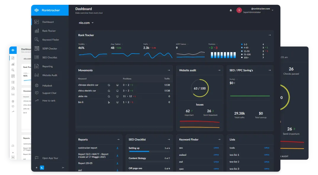
Use a Practical Power BI Dashboard Example
A good Power BI Dashboard Example can help teams understand what a clean client-facing view should look like. It shows how key metrics can be placed in a natural order without crowding the page. Examples are also useful when clients struggle to explain what they want from reporting.
Improve the Dashboard Based on Questions
Client questions are useful signals, not interruptions. If the same question comes up often, the dashboard may need a clearer label, better context, or a stronger visual. Over time, those small changes make the dashboard easier to trust and easier to use.
Conclusion
A Power BI dashboard works best when it is built around client understanding, not just internal reporting needs. The dashboard should make performance easier to read, easier to discuss, and easier to act on.
Good client reporting is not about adding more visuals. It is about giving clients a trusted view of the numbers that matter most. When the dashboard is simple, current, and properly managed, it becomes a stronger part of the client relationship.