Intro
An enjoyable browsing experience is a critical aspect of a high-converting website. And, in 2026, most business owners understand the importance of investing in user experience and user interface design. Nevertheless, there’s a common misconception about UX: that it’s strictly limited to visual and pattern choices in web design.
While page layout, content organization, and even aesthetic appeal all affect user experience, they’re not the only things that matter. Technical factors (such as site speed, responsiveness, and accessibility) and copywriting also affect how enjoyable visitors find online interactions.
This guide focuses on the messaging aspect of UX design. It outlines some of the website messaging best practices that improve user experience. Moreover, it provides several examples of what these strategies look like in real-life settings. Let’s get started!
Match Messaging to Search Intent
Multiple website messaging optimization tactics can help you improve user experience. But if you want to focus your efforts on the one that works best — especially if you’re also interested in minimizing web bounce rates — the best thing you can do is to produce web messaging that reflects your web visitors’ search intent.
Ultimately, consumers browsing the internet for solutions will always have a specific issue they hope your offer can resolve. By ensuring that the copy they see upon landing on your website confirms you have what they need, you can quickly signal they’re in the right place. Moreover, you can encourage them to engage with your web content (with the hope of them moving into the lower stages of the sales funnel).
In SEO, this tactic is often referred to as search intent optimization. Essentially, the concept relies on the presumption that web users always have one of four outcomes in mind when using search engines (finding information, navigating to a digital location, comparing product options, or making a purchase). So, by producing web copy that mirrors your target audience’s pain points, wants, and needs, you can make it easier for them to realize they’re in the right place (and reduce their likelihood of bouncing).
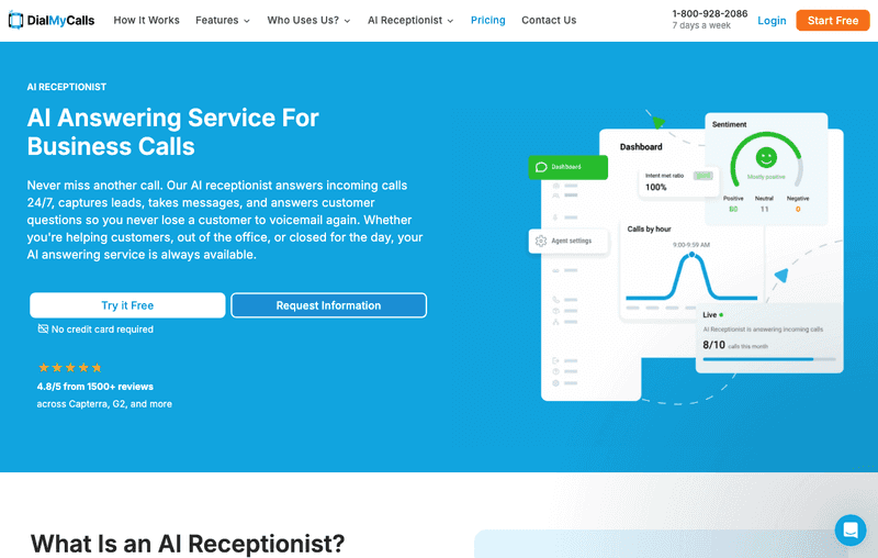
The AI Answering Service landing page by DialMyCalls is an excellent example of this UX copywriting strategy in action. With a single glance at the page’s top section, web visitors can easily confirm that the page discusses an AI phone answering solution. Furthermore, the copy highlighted in the hero section quickly introduces web visitors to the products’ core benefits and uses. Such an approach enables web visitors to easily confirm they’re interacting with a business that offers the exact type of solution they need. Moreover, the clarity and no-delay focus on what the business does (and why the offer matters to potential customers) ensure an enjoyable and productive user experience that will inevitably lead to higher conversion rates simply due to the content’s relevance.
The All-in-One Platform for Effective SEO
Behind every successful business is a strong SEO campaign. But with countless optimization tools and techniques out there to choose from, it can be hard to know where to start. Well, fear no more, cause I've got just the thing to help. Presenting the Ranktracker all-in-one platform for effective SEO
We have finally opened registration to Ranktracker absolutely free!
Create a free accountOr Sign in using your credentials
Source: dialmycalls.com
Make Content Easy to Scan
Great, conversion-inspiring UX design has to always align with common web user behavior patterns.
When you understand how web users interact with digital content, you can successfully optimize your web pages to match your audience’s expectations and preferences. In doing so, you’ll provide them with a more enjoyable browsing experience. But more importantly, you can make it easier for them to notice and find relevant, purchase-inspiring information about your offer.
One of the most common web user behaviors you can use to inform your UX design and messaging has to do with how much people read online.
According to research spanning over two decades, most people don’t read online. They’re far more likely to scan than read word for word. And they tend to follow predictable content consumption patterns centering around attention-grabbing anchors.
With this in mind, one of the website messaging best practices for improving user experience includes optimizing webpage content for scannability. The best way to do this is to employ clear subheading styles, communicate important information early on, use formatting techniques to guide web visitors’ attention to key information, and use plain language to avoid readability-related obstacles.
The All-in-One Platform for Effective SEO
Behind every successful business is a strong SEO campaign. But with countless optimization tools and techniques out there to choose from, it can be hard to know where to start. Well, fear no more, cause I've got just the thing to help. Presenting the Ranktracker all-in-one platform for effective SEO
We have finally opened registration to Ranktracker absolutely free!
Create a free accountOr Sign in using your credentials
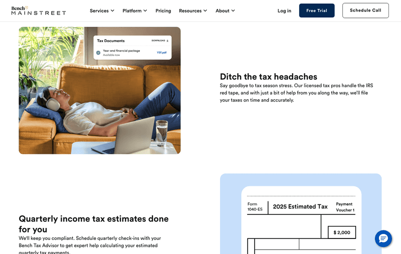
If you check out the Small Business Tax Filing service page on the Bench website, you’ll find that the brand effectively uses this messaging optimization strategy in the benefits section of the page. By communicating each product benefit separately — with a simple heading, a detailed description, and an image for illustration — Bench makes it easy for web visitors to scan all of these factors (and easily decide whether the solution is the right choice for their needs). Furthermore, it’s worth noting that the website employs the lawnmower layout pattern, which aligns with how web users view content pages that combine copy with visuals, creating an overall predictable and enjoyable user experience that maximizes product understanding and guides visitors toward a purchase decision.
Source: bench.co
Prioritize Clarity Over Cleverness
In some industries, the best way to attract consumer attention is to rely on catchy slogans or try to arouse curiosity with vague messaging. But when it comes to ensuring an enjoyable user experience with website copy, these tactics are the exact _opposite _of what you should be aiming for.
Yes, impressive claims, witty catchphrases, and amusing messages can do wonders for your branding strategy. However, when aiming to provide your web visitors with a pleasant user experience (that will, ideally, elevate purchase intent), clarity always beats cleverness.
This website messaging tactic works (and it’s equally effective when implemented on- and off-site) because consumers often seek instant confirmation that what your business offers is relevant to their needs.
In fact, research clearly shows that relevance is the key web messaging characteristic that makes or breaks conversions, with 81% of people saying they actively ignore branded content/communication that doesn’t seem relevant to their experience.
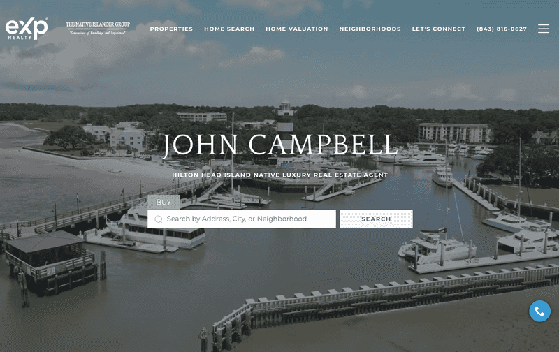
With this in mind, one of the best practices for elevating UX through website messaging is to prioritize clarity. It’s exactly what John Sells Hilton Head does on its homepage. This business begins by stating the type of service it offers and the location in which it operates. Furthermore, the messaging directly addresses target audience segments (sellers and buyers) to help web visitors recognize themselves in the copy. This type of user-centric approach doesn’t just ensure a high level of service understanding — which is crucial for elevating purchase intent. It also encourages movement through the sales funnel by making it crystal clear to web visitors what steps they should take next to resolve their pain points.
Source: johnsellshiltonhead.com
Keep Messaging Consistent
Some UX design best practices may differ, depending on what you’re trying to achieve. Others, however, remain constant across content types, distribution channels, and even changing web design trends. Consistency is one such element of UX design, and its value isn’t just that it elevates the predictability of the browsing experience (which consumers love, according to research).
When you keep your messaging consistent, you achieve two effects.
On the one hand, consistency minimizes confusion. It can help you keep web visitors focused on the primary value of your offer by continually reinforcing your main value proposition message.
On the other hand, consistency breeds familiarity — a powerful trust-building element (and therefore, a crucial purchase-influencing factor).
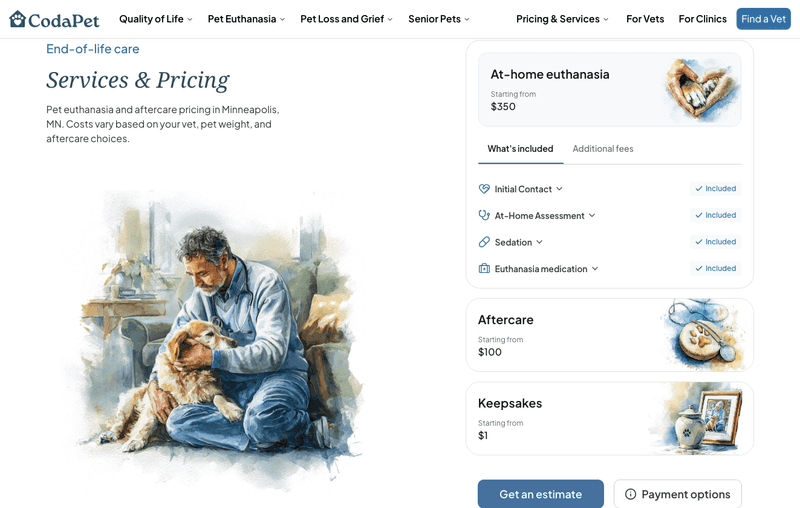
For instance, if you check out CodaPet’s city-based landing pages, like this one, you’ll find that this brand actively incorporates messaging consistency into its online presence. And with good cause. CodaPet operates in a very sensitive industry, providing end-of-life care to pets. This means that it doesn’t just have to ensure its target audience trusts its expertise, experience, and empathy. It also has to ensure an exceptional level of service understanding before imploring prospects to convert. That’s why each of the brand’s service descriptions and calls to action reinforce what the company offers — dignified, empathetic care that prioritizes pets’ comfort while giving owners transparency about the process, costs, and availability.
Source: codapet.com
Write Better Calls to Action
Even though CTA buttons are regularly discussed when exploring conversion optimization tactics that aim to guide user action, they’re rarely ever studied from a messaging standpoint.
Traditionally, copywriting best practices for calls to action stop at the basics: use active language, prioritize brevity, and use first-person language. Power words and FOMO-inducing messages can be a solid addition. But, in most cases, that’s where the advice stops.
But the truth is, despite being a great start, these optimization tactics aren’t necessarily enough to provide an enjoyable browsing experience to web visitors. Instead, when aiming to enhance UX and guide leads through the buyer’s journey, it’s important to focus on two key actions.
On the one hand, it’s essential to help web visitors understand what outcome they can achieve by clicking a button (or taking any other action). On the other hand, it’s equally important to reduce conversion friction through trust-building microcopy and prevent qualified prospects from abandoning the buyer’s journey.
The best way to achieve this through messaging optimization is to maintain a strong focus on the end result your target audience can expect when signing up for your services and use sufficient trust-building microcopy to reduce purchase anxiety.
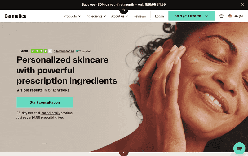
The Dermatica homepage does both exceptionally well. For starters, this brand makes its CTAs a natural extension of its value proposition. As it offers tailored_ _skincare that aims to deliver visible results in 8-12 weeks, this business invites prospects to ‘Start consultation’ — a message that clarifies how it plans to deliver a truly personalized regimen. Secondly, as most shoppers need some reassurance before committing to a purchase (especially for long-term subscriptions and big-ticket items), Dermatica uses microcopy to emphasize its 28-day free trial and easy cancellation policy.
Source: dermatica.com
Build Trust with Social Proof
When discussing user experience design — especially in the context of consumers’ risk aversion — it’s impossible not to touch on trust marketing.
Though not commonly seen as a UX design tactic, trust plays a crucial role in shaping outcomes within the buyer’s journey. In fact, research shows that brand trust and credibility consistently rank among the top three factors influencing consumers’ decision-making process (along with product quality and value for money).
In other words, most consumers require reassurance that they’re putting their faith in a business with experience and expertise and that it can be relied upon to prioritize customer satisfaction — especially in sensitive industries like healthcare.
Incorporating social proof elements into your website is the most effective (and easy-to-implement) UX strategy to accomplish this goal.
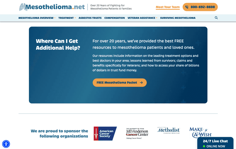
User-generated content, like that used by Mesothelioma.net, is an excellent example of messaging that establishes credibility. The content clearly highlights the team’s authority. It also provides much-needed verification of the brand’s claims — particularly those claiming expertise and customer-orientedness. Including such messaging elements in its online presence doesn’t just build trust. It contributes to a more enjoyable, safe-feeling browsing experience that is strongly rooted in the fact that the business can prove its credibility and doesn’t expect potential prospects to have blind faith in its claims.
Source: mesothelioma.net
Address User Questions Early
Finally, when designing a positive website user experience — ideally one that encourages conversion — keep in mind that most consumers have questions during the buyer’s journey. When ignored, these questions often grow into doubts and uncertainty. And in some cases — especially when consumers feel confused or overwhelmed — these doubts can effectively cut the buyer’s journey short and cause sales funnel abandonment.
Proactive website messaging, which focuses on answering user questions early within the sales cycle, prevents these negative conversion outcomes. It works because educational information — particularly when delivered in a user-centric way — builds confidence before web users even realize they need to dig deeper to find the information they require.
The All-in-One Platform for Effective SEO
Behind every successful business is a strong SEO campaign. But with countless optimization tools and techniques out there to choose from, it can be hard to know where to start. Well, fear no more, cause I've got just the thing to help. Presenting the Ranktracker all-in-one platform for effective SEO
We have finally opened registration to Ranktracker absolutely free!
Create a free accountOr Sign in using your credentials
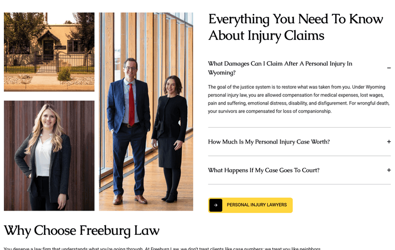
For instance, businesses operating in complex industries and niches, such as Freeburg Law, commonly anticipate the questions their potential clients may have. So, they use proactive messaging to answer these inquiries. They provide insights into service costs, team experience, expected results, and how niche processes work. And, in doing so, they gradually build confidence. They convince web visitors that they’re in the right place to resolve their pain points. More importantly, they demonstrate to prospects that they can rely on the business thanks to its credibility and willingness to guide clients through each step of the buyer’s journey without exerting unnecessary sales pressure.
Source: tetonattorney.com
Final Thoughts
A website that provides an enjoyable, educational, and user-friendly experience is far more likely to drive conversions than one that’s clunky, confusing, or difficult to trust. Investing in UX — and more specifically, optimizing your messaging for customer-centricity — is such an important aspect of driving sales.
The tips outlined in this guide are an excellent start toward ensuring your web copy engages, reassures, and encourages your visitors to move into your sales funnel. Don’t hesitate to give them a try. Even a few small tweaks can deliver impressive results. So, why not benefit?