Intro
Elit-Web experts share their observations.
Now, in 2023, we take mobile-friendly sites for granted. But it was not always like that. When Google released a major mobile search update in 2015, most webmasters and SEO specialists were literally at a loss as to how to act and what to do in order to maintain the site's positions they had won for so long from competitors.

But why did this happen?
One of the main changes in the ranking of sites was that Google's algorithms began to pay special attention to UX. That is, the convenience of sites not only on PCs, but also on mobile devices, has become especially significant for the formation of the rating of web resources and their positions in search results.
In addition, in 2015, the "skew" became more and more clearly visible - the amount of mobile traffic gradually began to prevail over desktop traffic. And if the site was too "heavy" and not optimized, using it from a smartphone was extremely inconvenient. Accordingly, the rate of rejections increased, and the position of the resource in the search results dropped significantly.
Fortunately, already at that time, Google offered to optimize sites with the help of available adaptive web design technologies, which significantly simplified this process.
What is Responsive Design?
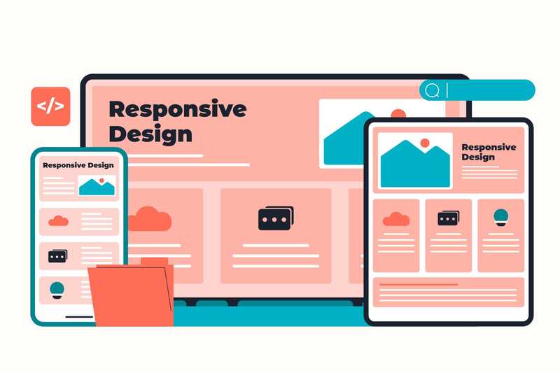
Responsive Web Design (RWD) is a method by which a resource page is reformatted to fit the format and size of the device's screen without the need for manual scaling.

The All-in-One Platform for Effective SEO
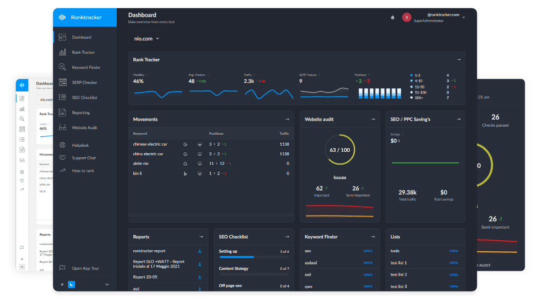
Behind every successful business is a strong SEO campaign. But with countless optimization tools and techniques out there to choose from, it can be hard to know where to start. Well, fear no more, cause I've got just the thing to help. Presenting the Ranktracker all-in-one platform for effective SEO
We have finally opened registration to Ranktracker absolutely free!
Create a free accountOr Sign in using your credentials
It greatly improves the interaction with the user by increasing the visual content and buttons, changing the textual content and the sizes of various elements to best match the parameters of the gadget used by the site visitor.
RWD has several important advantages at once:
- **improved accessibility **for users with different devices. This is important because more and more people access the Internet through smartphones or tablets;
- improved user experience. This is due to the fact that visitors can easily read text, see images and interact with website elements, regardless of the screen size of the device;
- improved SEO. As Google and other search engines find responsive resources more user-friendly, they rank them higher in search results.
As for the last point, perhaps you need to explain a little more.
What is SEO?
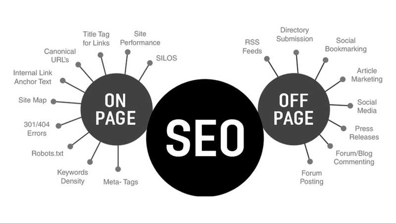
Search engine optimization (SEO) is a set of works aimed at bringing the site to the top of the rankings for relevant queries (keywords and phrases).

Here it is important to understand that Google algorithms take into account whether the resource is adapted for mobile devices. And if this is not the case, then now, in 2023, such a site will definitely not be able to make it to the top of the list. Adaptability is an extremely important technical parameter. That is why the Mobile-First development principle, under which the mobile version is developed first, and then the desktop version, is a priority in most cases. So today, site design is not only an element of aesthetics, but also a very influential factor for ranking in search results.
What is UX
UX (User Experience) is a term used to describe how users interact with a product or service.
The more relevant, convenient, accessible and useful your site is for visitors, the more loyal Google is to it and the higher the chances of getting to the top of the search results. What is important is that the need for high-quality UX was known long before the 2015 update. And those webmasters and site owners, who first of all thought about users, at that time were able to significantly improve the rating of their resources. Conversely, projects with poor UX immediately lost ground.
We should also add that SEO and UX work best in combination, not each on its own. Therefore, they must be correctly combined and used to the full. More on that later!
How SEO and UX work together
In short, SEO is responsible for ensuring that the website is well positioned in search results, and UX is responsible for ensuring that users have a good experience interacting with the resource. When they work together, they help the online project succeed. SEO allows you to attract more visitors, while UX motivates them to stay on the website and take targeted actions. For example, to buy goods or subscribe to a newsletter.
In addition, responsive design makes it easier for SEO and UX specialists, among other things. Search engines scan adaptive sites more actively and more accurately, giving them higher ratings. And it is more pleasant and easier for visitors to use web resources that work correctly and do not cause any inconvenience.
7 Benefits of Responsive Design to Improve SEO and UX
We suggest you take a look at how responsive site design directly improves SEO and UX and what principles it is based on.
- Improving the ranking in search results
It is not the first year that Google prefers resources adapted for mobile devices. According to the results of the Backlinko company research, about 94.5% of all sites that occupy the first three positions in the Google search results have a responsive design. Therefore, it is easy to conclude that the presence of RWD significantly improves your chances of appearing in the top results for relevant queries.
2. Speed up loading
For the most part, responsive design really makes pages load faster. Here it is important to understand that it uses a single set of HTML and CSS code that automatically adjusts to different gadget screen sizes. And such a resource opens much faster than a "heavy" site, which has two separate versions of the code for desktop and mobile devices. And loading speed has a huge impact on user experience, bounce rate and, accordingly, SEO performance.
3. Improving the ease of use of the site
Responsive sites are simply easier to use. And not only view information, but also interact with the page — press buttons, open menus, flip slides, etc. In addition, such sites take into account how the user holds the phone - vertically or horizontally. Accordingly, the layout of the page is optimized and adapted.
The All-in-One Platform for Effective SEO
Behind every successful business is a strong SEO campaign. But with countless optimization tools and techniques out there to choose from, it can be hard to know where to start. Well, fear no more, cause I've got just the thing to help. Presenting the Ranktracker all-in-one platform for effective SEO
We have finally opened registration to Ranktracker absolutely free!
Create a free accountOr Sign in using your credentials
User-friendly design automatically extends the time users spend on the page, thereby improving behavioral factors. And this is important for Google. After all, if a person spends some time on the site, browses various pages, gets acquainted with information, then the resource offers high-quality and interesting content. Therefore, it can be displayed at the top of search results.

4. Reduction of the failure rate
This point is partially intertwined with the second. If a site takes longer than 3 seconds to open, about 53% of users will simply close it and not wait. And if the duration of the download reaches 10 seconds, then the probability that a person will wait is practically zero.
Of course, the speed of opening a page is affected not only by the adaptability of the site, but also by other factors. Either way, you should do everything so that your resource does not take longer than 3 seconds to load. The faster, the lower the failure rate.
5. Repeat traffic
According to the WebFX company, about 74% of mobile device users return to a site that was convenient and comfortable for them to use, rather than looking for an alternative. That is, good UX and SEO significantly increase the volume of repeat traffic and attract regular users.
The All-in-One Platform for Effective SEO
Behind every successful business is a strong SEO campaign. But with countless optimization tools and techniques out there to choose from, it can be hard to know where to start. Well, fear no more, cause I've got just the thing to help. Presenting the Ranktracker all-in-one platform for effective SEO
We have finally opened registration to Ranktracker absolutely free!
Create a free accountOr Sign in using your credentials
This is very useful, because for Google it is another powerful signal that the site is really convenient, useful and relevant for people. And this means that it can be recommended and rise higher in search results for relevant queries.
6. Indirect benefit from social exchange
If the site has a good responsive design, contains useful and relevant information, users are more likely to share it on their social networks. Especially if they are encouraged to do so. For example, by offering a discount or bonus.
When users share links to your site on social networks, you get additional traffic. And for Google, this is, again, a signal about the quality and relevance of your resource, and it raises it in the search results. At the same time, such publications do not have a direct impact on SEO indicators.
7. Increasing the number of conversions
Increasing positions in search results, increasing presence in social networks, improving brand awareness - all this affects the number of conversions. And, as we have already learned, these parameters are indeed very closely related to responsive design. Therefore, if you really want to increase the number of conversions on your site, the first thing you should do is to make it really user-friendly on different devices.
Conclusions
According to the Ericsson Mobility Report, from 2011 to the present day, the share of mobile traffic in the world has increased almost 300 times. And now it significantly prevails over the desktop one. Therefore, the principle of Mobile-First web development looks absolutely logical for almost any site.
To put it bluntly, creating only a desktop version of a resource today is absolute nonsense. Such a site has almost no chance to get to the top of search results, even in low-competitive niches. And when we talk about business areas with high competition, then the lack of adaptability is a critical mistake.
Therefore, remember adaptability and UX, follow Google updates and adapt your own resource to the new requirements of the search engine in a timely manner. This is the only way to get to the top of the charts and maintain high positions.

