Intro
For the past few years, a new batch of web design trends has shown up – bolder fonts, wilder color palettes, layouts that look great on Dribbble but don't do much for the people actually visiting your site.
The trends that matter to a business are the ones that change how search engines evaluate and rank the site. Or the ones that get more visitors to stick around and actually do something.
That is exactly what we will sort out in this article. We will show you 9 web design trends that businesses with real traffic and revenue targets are putting money behind. You will also see 5 strategies for testing any of them before you commit to a full redesign.
9 Latest Web Design Trends That Are Driving Business Results Right Now
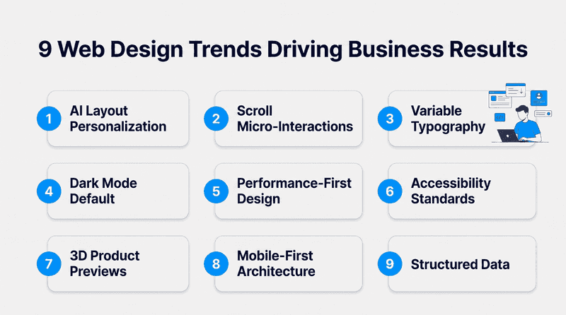
These are 9 modern web design trends that are already producing measurable differences in engagement and organic visibility for the businesses running them.
1. AI-Powered Layout Personalization
A first-time visitor from Google and a returning customer from an email campaign have nothing in common. But most websites show them the exact same page. AI-powered personalization changes the layout itself based on who is visiting. Not just swapping a headline. Rearranging which sections appear first, which CTAs show up, and where product categories sit on the page.
AI-powered personalization is especially effective on homepage design because it adapts to different visitors. eCommerce sites are doing this to put relevant categories in front of returning shoppers instantly. SaaS companies are matching feature copy to the visitor's industry so the page speaks to what that person actually cares about.
If you are already using AI to shape how search engines read your site, extending that into what visitors see on the page is a natural next move. But personalization should still leave room for human connection, especially around support and sales.
2. Scroll-Triggered Micro-Interactions
A button that shifts color when you hover over it. A number that ticks up as you scroll past a stat. A card that fades in as it enters the viewport or geometric shapes that respond to scrolling. These are micro-interactions – small responses that add visual interest and tell the visitor the page is alive and somebody thought about the details.
The All-in-One Platform for Effective SEO
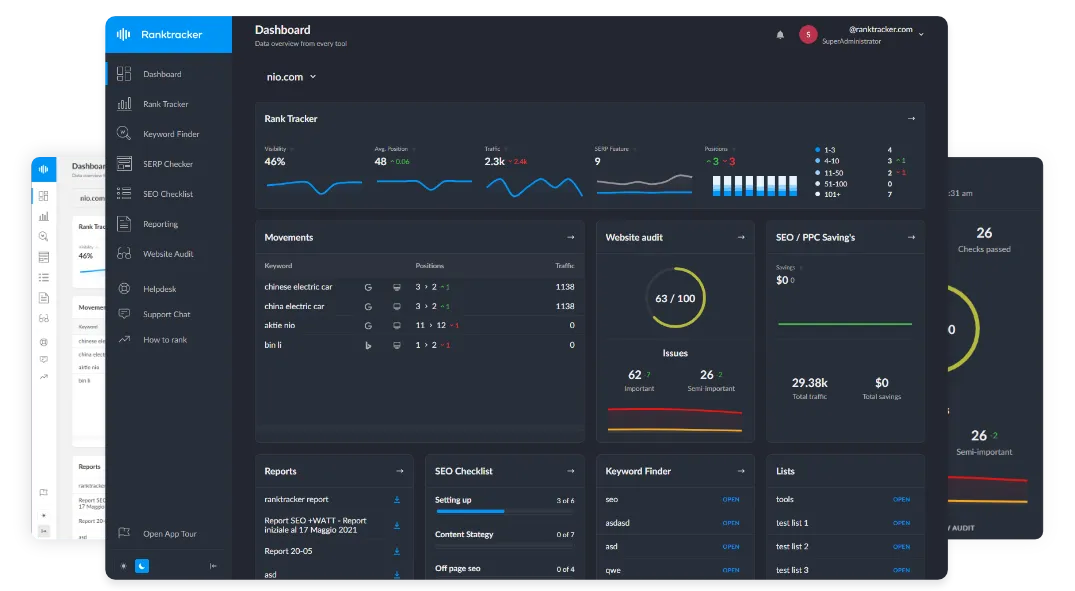
Behind every successful business is a strong SEO campaign. But with countless optimization tools and techniques out there to choose from, it can be hard to know where to start. Well, fear no more, cause I've got just the thing to help. Presenting the Ranktracker all-in-one platform for effective SEO
We have finally opened registration to Ranktracker absolutely free!
Create a free accountOr Sign in using your credentials
Pages with these tend to hold attention longer than decorative sticker graphics that clutter the page. More scroll depth means more exposure to the stuff that actually matters – your pricing section, your signup form, your product details. That shows up in UX metrics that feed into how Google evaluates page quality.
Two or three per page sections are enough. Go past that, and you are adding JavaScript weight and visual complexity that works against you.
3. Variable Typography as Brand Identity
A site can be visually appealing without sacrificing performance. Variable fonts pack multiple weights and widths into a single file. Your site gets thin headers and medium body text and bold callouts – all from one HTTP request instead of three separate font files loading independently.
The branding side matters too. Custom typography gives graphic artists one of the quickest ways to make a site feel like it belongs to a specific company rather than a template. It leaves a lasting impression because people notice typefaces before they read the words. That recognition adds up across every page a visitor touches.
And because a single variable font file replaces three static ones, it cuts page weight. When how you present visual content affects your search visibility, trimming unnecessary font requests is worth doing.
4. Dark Mode as a Default User Setting
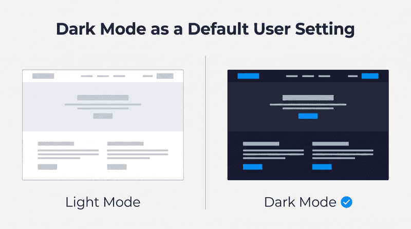
Dark mode has become an expected feature on modern websites. Most mobile users have dark mode turned on at the operating system level. When someone with that setting lands on a site that is solid white, they get a bright flash before the page even loads. It feels broken. Sites that offer dark mode as a built-in option avoid that entirely.
Building it properly takes more than inverting colors. Contrast ratios need separate testing in both modes. Image backgrounds need transparent versions or dark-specific alternatives. The same applies to large background images used in hero sections.
The All-in-One Platform for Effective SEO
Behind every successful business is a strong SEO campaign. But with countless optimization tools and techniques out there to choose from, it can be hard to know where to start. Well, fear no more, cause I've got just the thing to help. Presenting the Ranktracker all-in-one platform for effective SEO
We have finally opened registration to Ranktracker absolutely free!
Create a free accountOr Sign in using your credentials
Form inputs need visible borders against dark surfaces so they don't disappear. Designers also need to make sure bright colors and natural textures remain visible in dark mode.
5. Performance-Optimized Visual Design
Page speed directly impacts site rankings. That is not a suggestion – Google's algorithm treats it as a measurable input. And most of the digital elements that slow a site down are design decisions: uncompressed hero images, custom illustrations, video backgrounds, JavaScript-heavy animations, three separate font files loading on every page.
According to Loopex Digital, only 47% of sites currently pass Google's Core Web Vitals benchmarks. More than half are already losing ranking ground because their pages load too slowly or shift around while rendering.
The fix is designing with speed as a constraint from the start. Use CSS transitions instead of JavaScript animations. Lazy-load anything below the fold. Swap PNGs for WebP. Every design choice has a speed cost, and the sites that rank well are the ones where someone actually measured it.
6. Accessibility-First Design Standards
Retrofitting accessibility onto a finished site is expensive and usually incomplete. Building it in from the wireframing stage – checking contrast ratios during website design, testing keyboard navigation during prototyping – produces a site that works for everyone without adding fixes after the fact.
The 2026 WebAIM Million report found that 95.9% of home pages had detectable WCAG 2 failures. Low-contrast text alone showed up on nearly four out of five sites tested. That is not an edge case — that is almost the entire web failing a basic standard.
Google also tracks accessibility signals when deciding how to index and rank pages. Clean semantic HTML and proper heading structure – the same things that make a site accessible – are also the things that help crawlers understand your content. One fix serves both purposes.
7. Interactive 3D Product Previews
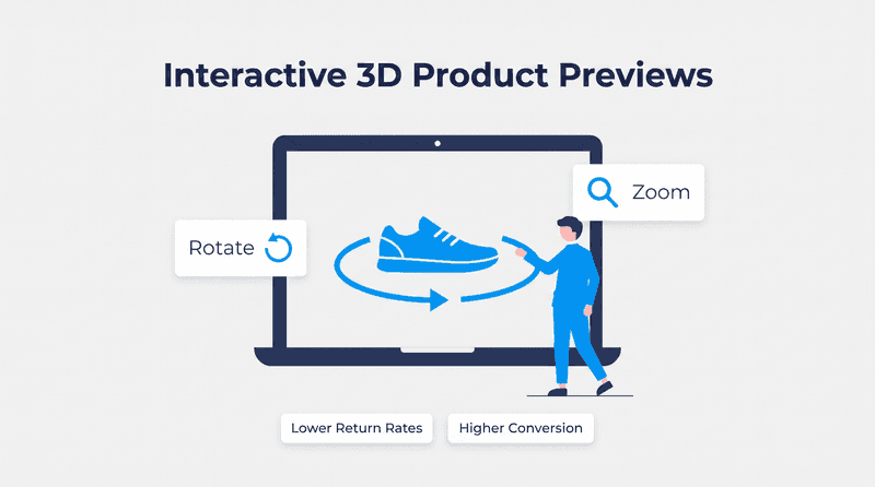
The 3D preview gives buyers far more confidence than static stock images. A flat product photo tells you what something looks like from one angle. A 3D preview with interactive elements lets a shopper rotate it and zoom in on the details the same way they would handle it in a store.
WebGL and compressed glTF models have made this fast enough that a 3D viewer can load in under a second on most phones now.
The return rate drop is the real payoff. When a customer has already inspected the product from every angle before buying, they are far less likely to send it back. For eCommerce businesses, that reduction in returns often covers the cost of building the viewer within a few months.
This matters outside of retail too. Manufacturing companies sell complex parts and custom assemblies where buyers need to inspect tolerances and surface finishes before requesting a quote. But most manufacturers don't have web teams that can build 3D product viewers from scratch.
For companies in that position, working with a manufacturing website design firm like weCreate can make a big difference. They understand what procurement managers look for. Spec tables, RFQ forms, and interactive product views that let a buyer evaluate a part without requesting a physical sample.
Manufacturers who add that capability shorten the sales cycle because engineering teams spend less time answering basic product questions or shipping sample parts for initial evaluation. Buyers can compare mounting points and finish options before they ever contact sales.
That means sales conversations start with project requirements, which helps manufacturing firms process RFQs faster and move qualified buyers into production with fewer delays.
8. Mobile-First Layout Architecture
Responsive design takes a desktop layout and scales it down for phones. Mobile-first design starts with the phone screen and adds complexity for bigger displays. The difference sounds subtle, but it changes what gets prioritized.
On a 375-pixel screen, you can't fit a sidebar, a hero banner, and a three-column grid. So you have to decide what actually matters and establish a clear visual hierarchy.
That forced prioritization makes the desktop version better, too. Pages designed mobile-first tend to load faster because the web designer followed minimalist design principles and already stripped out anything that wasn't earning its space.
When your site's layout affects the engagement signals Google tracks, starting from the smallest screen gives you the cleanest structured layout to build on. It also creates a simpler digital foundation for businesses investing in AI-enabled workflows across departments. As more of that infrastructure work gets automated, the constraint shifts from technical capacity to coordination.
9. Structured Data Integrated Into Page Design
Structured data tells Google exactly what is on a page – product pricing and review ratings, or event dates and business hours. Most sites add it later. The digital design ships first, then someone adds JSON-LD blocks to the finished pages and hopes the data matches.
The sites earning rich snippets in search results do it the other way around. They design product page templates where the fields map directly to schema properties from the start. When the design and the markup are built together, nothing falls out of sync when content gets updated later.
The payoff is visible in the search results themselves. A listing with star ratings and pricing gets more clicks than a plain blue link sitting right next to it. That extra real estate in the SERP compounds across every page that has proper schema in place.
| Trend | Primary Business Impact | Implementation Effort |
| AI Layout Personalization | Higher conversion rates | High: analytics integration |
| Scroll Micro-Interactions | Longer time on page | Low: CSS and minimal JS |
| Variable Typography | Brand distinction + faster load | Low: single font file swap |
| Dark Mode | Lower mobile bounce rate | Medium: separate color scheme |
| Performance-First Design | Better rankings + faster pages | Medium: ongoing optimization |
| Accessibility Standards | Legal compliance + cleaner code | Medium: design process change |
| 3D Product Previews | Lower product return rates | High: 3D model creation |
| Mobile-First Architecture | Stronger mobile engagement | Medium: layout restructure |
| Structured Data in Design | Rich snippets in search results | Low: schema templates |
How to Test a Web Design Trend Before a Full Redesign
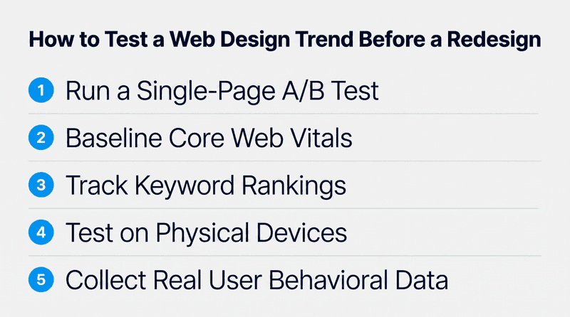
Redesigning based on a trend you saw on someone else's site is how you end up three months into a rollback. These five strategies tell you whether a website design trend actually works on your site with your target audience before you go all-in.
1. Run a Single-Page A/B Test Before Sitewide Rollout
A single-page A/B test is a great starting point before committing to a redesign. A trend can look great in a Figma mockup and still disappoint real visitors. Pick one high-traffic page and run the new design against the current one with traffic split evenly. Two weeks of data from real visitors tells you more than any amount of internal review ever will.
- Split traffic 50/50 between the existing and updated design for a minimum of 14 days
- Measure conversion rate and bounce rate side by side, not just one metric in isolation
- **Use a page with at least 500 weekly visitors **so the sample size actually means something
- Change only one design element per variant so you can trace any performance shift clearly
2. Baseline Your Core Web Vitals Before Making Any Change
A new hero animation or an extra font file can push your Largest Contentful Paint past the threshold Google cares about. And you won't know until rankings start dropping. Recording your current LCP and CLS scores before anything else gives you a reference point. If the numbers move after the change, you will see it immediately.
- Record LCP and CLS scores for your five highest-traffic page templates using PageSpeed Insights
- Run the same test on mobile and desktop separately. The numbers are usually very different
- Save the results as a dated snapshot you can compare directly against post-launch scores
- Decide on a rollback trigger before you launch. If CLS goes above 0.1, revert immediately
3. Track Keyword Rankings Through the Entire Rollout Window
When you change a page's structure, Google re-crawls it and re-evaluates how the content is organized. Moving a primary heading lower on the page or restructuring the content can shift where that page ranks. And you won't notice unless you are watching the keywords daily during the rollout period.
- Start daily position monitoring one week before the rollout to establish a stable baseline
- Flag any page that drops more than three positions during the first week after launch
- Cross-reference ranking movement with crawl logs to confirm Google has seen the new layout
- Use SEO reporting tools that flag ranking shifts automatically instead of checking manually
4. Test on Physical Devices Across Operating Systems
Chrome DevTools does a reasonable job of simulating screen sizes, but it doesn't reproduce how an actual phone renders the page. A CSS animation that runs smoothly in a browser emulator can stutter on a two-year-old Android phone.
Touch targets that look fine with a mouse cursor turn out to be too small for a real thumb. You find these things on real hardware, or you find them from user complaints after launch.
- **Test on at least two Android phones **and two iPhones with different screen sizes
- Tap every button and link with your actual finger. Anything under 44 pixels will frustrate users
- Check scroll animations on mid-range devices, not just the newest phone in the office
- Turn off WiFi and test on a cellular connection to see how the design loads on real networks
5. Collect Behavioral Data From Real Users Within Two Weeks
A bounce rate increase after a redesign tells you something went wrong. It doesn't tell you what. Did users get confused by the new navigation? Was the page too slow? Did a CTA end up below the fold where nobody scrolls? Heatmaps and session recordings answer those questions in a way that numbers in a dashboard can't.
With 5,114 ADA digital accessibility lawsuits filed in the US in 2025, it is also worth watching for users struggling with contrast or keyboard navigation. Catching that in a session recording during week one is a lot cheaper than hearing about it from a lawyer six months later.
Once you have collected the data, the whole team needs to see it, not just the designer who made the change. The test results, the before/after comparisons, and the decision to keep or revert should live somewhere everyone can reference.
The All-in-One Platform for Effective SEO
Behind every successful business is a strong SEO campaign. But with countless optimization tools and techniques out there to choose from, it can be hard to know where to start. Well, fear no more, cause I've got just the thing to help. Presenting the Ranktracker all-in-one platform for effective SEO
We have finally opened registration to Ranktracker absolutely free!
Create a free accountOr Sign in using your credentials
And if your team is running internal documentation on SharePoint, the ShortPoint web design tool makes it easy to build clean pages for exactly this. You put together a design testing summary – heatmap screenshots, CWV scores, the final call on whether to ship – without waiting for IT to set up the page.
When a new round of testing starts three months later, the whole history is already there for whoever picks it up.
- **Install heatmaps on the redesigned pages **and review click patterns after 500 visitor sessions
- Watch at least 20 full session recordings to find the exact moments where people get stuck
- Run a one-question on-page survey asking visitors to rate the redesigned experience right away
- Compare data at the 7-day and 14-day marks before making a final keep-or-revert decision
Conclusion
Every web design trend in this article has something in common: you can measure whether it is working. Dark mode changes your mobile bounce rate. Variable fonts change your load time. 3D previews change your return rate. That is the filter worth applying to any trend in today's digital landscape.
Pick the two or three that strengthen your digital presence and match where your visitors come from and what they do on the site. Test one at a time. Keep what the data backs up.
We built Ranktracker to make that measurement part easy. Our rank tracking shows you exactly how keyword positions shift after a design change goes live – daily, across mobile and desktop. The web audit tool catches technical issues a new design might introduce before they start affecting your visibility. Get started now.